
Out of the comfort zone
- Kerry

- Jul 21, 2020
- 2 min read

I often have a few projects running alongside each other, whether it's commissions for Personalised Illustrations or children's book plans or illustration workshops. When this project came up I wondered how to go about tackling it!
I was asked my a local printer/publisher "Moorleys", to design 2 posters to go in their windows. As many of you will know I have all my children's books and greetings cards printed here, so they were aware of my style and how I work.
I began by hand drawing their logo, basically copying it but in my usual way of watercolour, pencil crayon and pen. This instantly gave their usual logo some texture and a new life.
I knew I wanted to create something that played to my strengths. All my work includes a narrative in some way and my favourite subjects to draw are people and animals. Ideas come much more naturally to me when I enjoy what I'm doing, and luckily Moorleys gave me the freedom to come up with anything! There was no specific brief other than to include their logo and all the services they provide.
I began this project in January, and luckily I was given a brilliant present at Christmas by my good friend and artist, Tracey Watson. She had bought me a stunning book by a collage artist called Mark Hearld, who creates beautiful bold designs around themes of nature. This really inspired me to sketch the first poster ideas.
Both posters are designed to give Moorleys a location identity. They are a small local business based in Ilkeston, Derbyshire, so I picked out certain key elements to indicate this.
From the roundabout at the top of the road which leads down to Moorleys, to the town centre with it's iconic St Marys Church and Scala Cinema, the eye is drawn around some key features as we read the big banners which tell us about the services Moorleys provide.
The swans and characters give the posters a little more movement and personality.
I was keen to keep my hand drawn style throughout the posters, so I worked on each element separately, then put them altogether in one big digital collage. This meant I could change the size or colours slightly if something wasn't working, without having to redraw the whole image again.
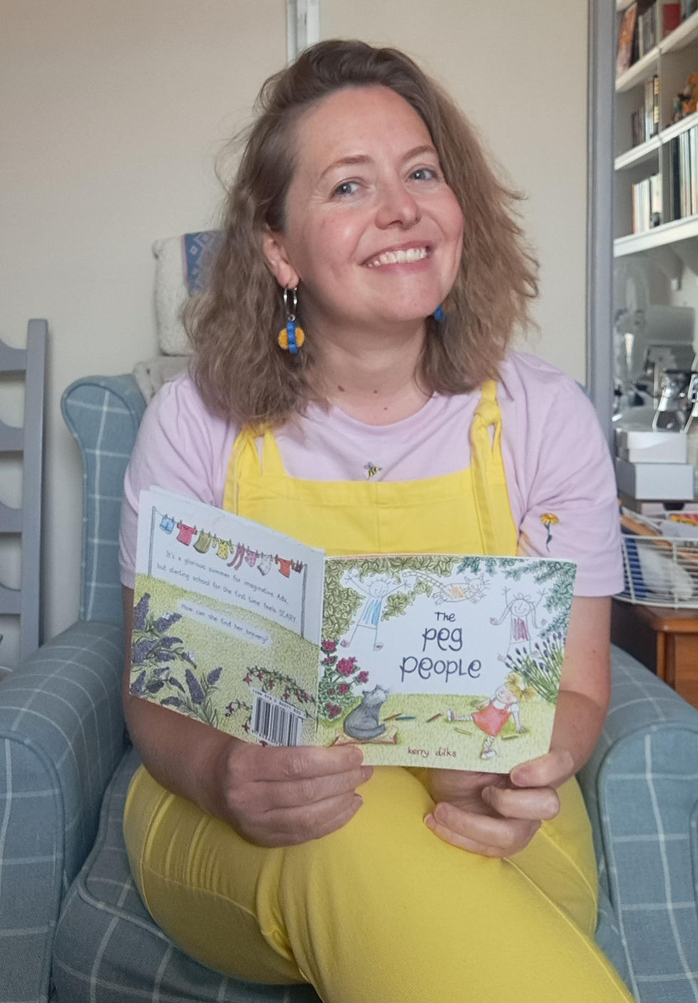
I decided on the colour palette pretty early on, using the main colours from the logo. I tried to limit the colour palette as much as possible, so stop the 2 posters looking too busy and confusing. However, I loved adding little details like the cherubs reading a book on the fountain, and the little girl character reading the children's book is from my own book "The Peg People".
If you'd like anything printed, Moorleys are a professional, friendly and efficient team. No job is too big or too small, and I highly recommend them:
https://www.moorleys.co.uk


Comments